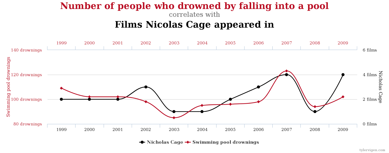
While others almost seem plausible like this one correlating revenue generated by arcades and computer science doctorates.

 But before there was a book there was (and still is) the site http://tylervigen.com/spurious-correlations The site has gone through a couple of incarnations but it's current form is a lot cleaner. I think the original site is a little nicer for one reason, though. It gives the table of data along with the graph. With the current site the graphs look nicer but to get the actual values for each point, you have to hover over any point to reveal them.
Classroom Connections
So what can we use this for? At the very least, we can use it to discuss the nature of correlation vs causation and the miss use of correlation by median, politicians etc. There is actually a nice little TEDx talk about this very thing: So just looking through the already created graphs is one thing that you could do. But there is an awesome feature built into the site that allows you to Discover a Correlation. So here you have access to all the data sets he has scraped from the net and use them to find your own spurious correlation. So you start by choosing the first variable you want to work with. To do that you first pick a topic and then click View Variables. You will then see all the datasets relating to that topic (for the below graph, I chose Miscellaneous). Choose the dataset you want to use as your first variable and then click Correlate (I chose Staple Sales). Then you get a list of all the datasets that have a strong correlation with the one you chose. So pick your favourite and the click on Chart (I chose Age of Academy Awards Best Actress). Note that as you see these variables you will see the correlation coefficient). And that creates the graph and gives you a permalink that will have the table of values and other correlation info.
Now what I can do is take that table of values and do some analysis on it. So for example, I imported that into Fathom and create the line of best fit or any other analysis that you would normally do for two variable data. So I would have your students find the most outrageous correlated variables and the do the analysis.

So have fun finding your spurious correlations. BTW, thanks to Mark Esping for reminding me of this site.
Resources
Main site: http://tylervigen.com/spurious-correlationsOriginal site: http://tylervigen.com/old-version.html
Build your own: http://tylervigen.com/discover


