Monday, May 17, 2021

Introductory Statistics Data Cards

I love this set of data cards created by @DavidButlerUoA (be sure to check out the comments on the post for more info from him):

These are ideal for when you are just starting out talking about stats. Each card is a data point with ten attributes (name, age, height, heart rate, temp, mood, arms, headgear, pet, bike). To me, you give these cards out to students with the instruction to sort them in any way they see fit and then see what happens. I wouldn't even tell them which attributes you have and just let them come to their own discoveries. This is a really great way for students to ease into the idea of analyzing statistics in a painless and approachable way. You can see some of the results that @DavidButlerUoA got here, here and here

Analysis

Once you have informally had students interact with these cards, you can continue to refer to them as you talk about the difference between categorical and numeric data, do some single variable stats measurements, two variable correlation and more. All the while you can keep referring to the cards in a more human context as each of them represents one "person" (though the data is made up, some of the relationships were taken from health studies). So although you will not solve any statistical mysteries with this data set, it is quite rich and divers and can be used to demonstrate many different statistical concepts. 

Sample Questions

  • Sort these cards into any arrangement you wish. What patterns do you see? Be sure to justify your arrangement(s).
  • What is the probability that if a person is happy, they are dancing?
  • Could riding a bike make you healthier?

Downloads

Original Cards as PDF (ideally printed on card stock, cut, and laminated)
Data (CSV, Google Docs, CODAP)

Be sure to check out David's other math related teaching materials on his Making Your Own Sense blog 

Let me know if you used this data set or if you have suggestions of what to do with it beyond this.


Sunday, May 16, 2021

Star Wars Data via Kaggle

Another repository of freely available data is called Kaggle.  "Inside Kaggle you’ll find all the code & data you need to do your data science work. Use over 50,000 public datasets and 400,000 public notebooks to conquer any analysis in no time." I like this repository because it seems to be easily searchable and there are a lot of data sets so you should be able to find one that is on an interesting topic for your students without too much trouble. 

And to show case a data set, I'm choosing one suggested to me by @virgonomic on data from the Star Wars franchise. And actually it's several data sets. 

Analysis 

There are four CSV files, one on characters, species, planets, starships and vehicles. Now you are not going to be doing any ground breaking statistical work here as the context of these data sets are pretty niche to die hard Star Wars fans. Like, I'm not sure who will care that the Bantha-II cargo skiff has a one day supply of consumables. None the less these are good data sets to be used for basic stats (finding mean, standard deviation, correlation etc). You can definitely find many attributes that are categorical as well. One thing I did noticed is that with most of the sets there was always one or two things that could be used to talk about outliers. Like Jabba the Hutt in the Character's dataset or the rotational period of planets in the planet data set


Sample Questions

  • When you consider the length of a vehicle compared to the number of crew it holds, are there any outliers?
  • What is the standard deviation of the _______ attribute in the _______ data set?
  • Find your favourite character. Pick and attribute and describe how your character compares to the others. 

BONUS data: Though this is not from this data set, it was recently Star Wars day and someone posted this infographic comparing the number of lines each character spoke and what words they spoke the most in the original trilogy. 


Downloads

Let me know if you used this data set or if you have suggestions of what to do with it beyond this.

Saturday, May 15, 2021

The Big Bang Theory Ratings & Viewership via Data.World

Data.World is a great site for data sets and they all seem to be freely downloadable once you create an account.  The site is a paid site but seems to be paid for people who use data in commerce. Members upload all kinds of data sets and you can search through them. 

To show that I've taken a sample data set about the Big Bang Theory TV show. It was a great show and  it doesn't matter whether you didn't watch it when it first aired because you can probably find an episode of the Big Bang Theory on TV at just about any time of the day. So if you are looking for some data then two data bases (Wikipedia and IMDB) were scraped to get information like ratings, viewership, plot line and more and housed at data.world

Analysis

There are several attributes to this data set (including episode descriptions and titles) but you probably want to stick to the numerical ones. You can do single variable analysis of the number of viewers, the votes and the ratings and some double variable analysis. I like the single variable analysis because you can separate the seasons and do a separate analysis for each season. 

Sample Questions

Which season had the highest average viewership?
Is there a connection between the rating and number of votes?
Which season(s) had the most popular episodes? 

Downloads 


Let me know if you used this data set or if you have suggestions of what to do with it beyond this.


Tuesday, March 26, 2019

Mining the Meta Data in your iTunes Library

If you (or your students) use iTunes to keep track of your music then it turns out they have a rich source of data that might be interesting for your students to analyze. I find that if students use their own data they are more interested in looking at that data for analysis. In this case, every song on iTunes (and really, any platform) has a pile of meta data associated with it. In that meta data are things like song name, artist name, album name but also there are numerical values like song length, file size, number of plays etc. So you could have your students get the data from their own library and do the analysis of it.

Getting the data from iTunes is pretty easy. Once in iTunes, if they want to get the info from all their music then just click on Songs or if they want to get their data from a favourite playlist then they can click on that. Then click on File, then Library, then Export Playlist. It will then send a .TXT file to the folder of your choice. That .txt file will need a bit of cleaning up, but not much. I suggest importing it into Excel or Google Sheets to clean it up. If you are doing the work in that spreadsheet (or uploading to Desmos) then you're all set. If you plan on importing it into CODAP then save the data as a .CSV file (note that I noticed that even though you should be able to import a .TXT file into CODAP, the format of this one doesn't seem to work, so you have to convert it to a . CSV).

Analysis

Though the data itself is not wildly interesting, you can certainly use it to cover topics like mean, median, standard deviation, and other single variable measures. And maybe have students compare values from their playlists to other students. Note, that the time of the songs are in seconds. So if a histogram is created, it is probably appropriate to have bin widths of 30s or 60s (let students figure this out).

One thing that I think is interesting is that you would expect a very strong (if not perfect) relationship between the time of a song and it's file size. But as you can see there seems to be different relationships. This is due to the bit rate of the file compression. So you might be able to have a conversation about what bit rate is and how it relates to the compression of the file. The lower the bit rate the smaller the file size (for songs of the same length). So you could talk about why you would want a lower or higher bit rate (hint: lower bit rate means poorer quality of the sound but smaller file size, so there is a trade off). In CODAP you can create separate graphs of the bit rate data and the scatter plot of the size vs time then high lite parts of the data to show the different relationships. You could actually hide or show data based on the bit rate to do more specific analysis by isolating just the data from one bit rate.

Sample Questions

  • Choose three numerical attributes from your data and determine the mean, median and SD of each. Graph each attribute using an appropriate representation.
  • Which genre of music has the highest average song length?
  • Which song was played the most?
  • Which decade has the most songs?
  • Which song was skipped the most?
  • Determine the relationship between the size of a file and how long the song is for different bit rates. 
  • You have only 50 Mb of space left on your device. How many minutes of music could you store using all of the remaining space (note that answers will vary based on the bit rate.

Downloads

Let me know if you used this data set or if you have suggestions of what to do with it beyond this.

Friday, March 22, 2019

Hip Hop Vocabulary

This post originally came out in 2014 (before this blog was created) and so I hadn't thought about it for a while. Then I saw a post by Dane Ehlert on his When Math Happens blog and was not only reminded of it but noticed that the original post had been updated in look and with new data. Basically they take a pile of hip hop artists and count how many unique words they use in their first 35000 lyrics.

Analysis

When you go to the site, the visualization (above) is interactive in that you can search for artists and interact with the visualization. This is neat but on this blog we typically want to do some mathematical analysis. They have other representations like this one that looks like a histogram but for our purposes, we would like some numbers.

 
So if you look way down on the post, they do have a Google Sheet with the number of unique words for each of the over 160 artists. It's not a particularly robust data set but we can do some simple
analysis, like histogram, averages, box plots and other single variable analysis. I don't think there is anything particularly mathematically interesting with the data but this is data that might be interesting for students and so it could be used to do practice some standard single variable analysis techniques (central tendance, standard deviation, distributions, dot plots, box plots, histograms etc)

Sample Questions

  • Who are the outliers in this data set?
  • Which decade has the most verbose rappers?
  • How does your favourite rapper compare to the most/least verbose rapper?
  • Take a look at some of the questions Dane was asking in his post for some more open questions.
  • What does the data in the original post say about the amount of words used in different types of music?

Downloads 


Let me know if you used this data set or if you have suggestions of what to do with it beyond this.

Sunday, February 24, 2019

Skipping World Record

A few months back I saw a 3Act Task called Rope Jumper that @gfletchy created out of this video:
He shows the first few seconds of the video and you have to guess how many skips are done in 30s. It's a good 3Act task. But that's not what we're doing here. Here I've actually collected the time data from each skip to do a bit of analysis (I had to slow the video down to 50% speed in order to get every skip).

Analysis

As you would guess it's pretty linear but you might notice, as you watch the video, that it seems like she might be slowing down at times. It's not super exciting in terms of the actual data but it could be used to simply help students in determining the least squared line.

Sample Questions

  • When was she skipping the fastest/slowest and what was the rate?
  • How many skips do you think she would make in 1 minute?
  • If she was to keep the pace that she had in the first few seconds, how many skips would she have made in 30s?
  • If she had skipped at the same rate as she did in her slowest section, would she still have broken the record.

Downloads

Let me know if you used this data set or if you have suggestions of what to do with it beyond this.

Thursday, February 7, 2019

New Desmos Statistics Package

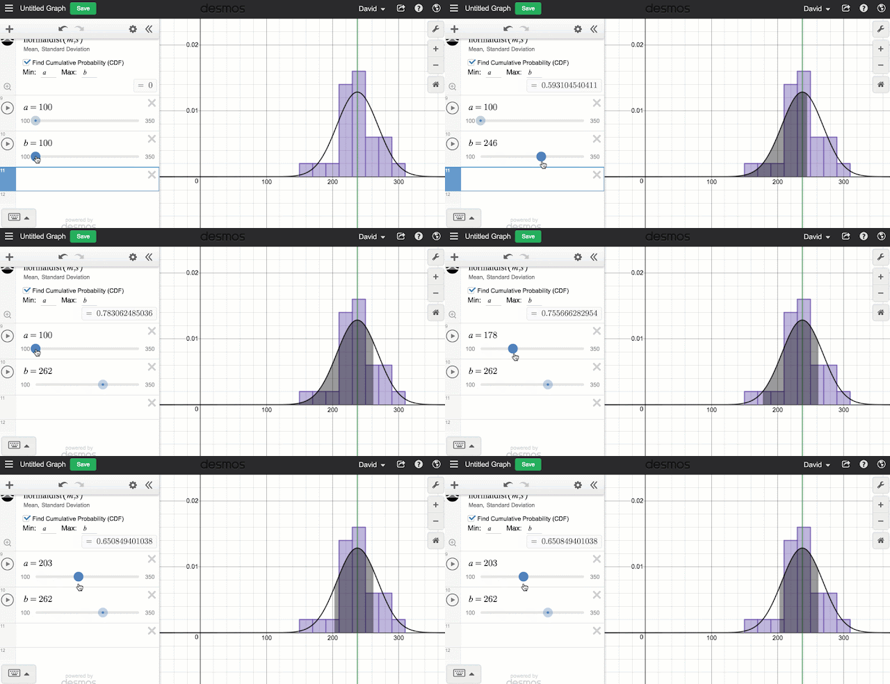
So for years you have been able to two variable statistics really well. Finding the correlation and lines and curves of best fit is pretty easy and works really well. But this week Desmos released a long awaited update to include a whole suite of new single variable statistical tools including visualizations like dot plots, box plots and histograms. And of course the great thing about all of this stuff is that all of these visualizations can be made dynamic with a few Desmos slider tricks. For a really nice summary of some of the new features, check out the video from @bobloch below.

But I wanted to point out a couple features that I really like. First of all the new Zoom Fit feature makes it easy to take any set of data and adjust the axes so that all the data can be seen. Basically all you do is create your graph and then click the icon that looks like the little magnifying glass with the plus in it. This icon will show up for any of the visualizations including the distributions. 
Another thing that I like is the control that you get with the various graphs. When you enter any of the functions you will be told what the arguments are for the function (like for histograms you have the data and you have the bin width) or you have arguments outside the function. For example, for box plot you can change the vertical position (Offset) of the box and it's vertical size (Height). But any of those values can be turned into dynamic values by creating sliders or the results of computations. 

Like all Desmos graphs you can save your work and this is probably the best way to get large data sets to students. And if you want to name your sets, you can get a bit more creative by using subscripts. To get to a subscript, start with a variable and then add a "1" and the subscript will appear. Then you can delete the 1 and add what ever you want in its place. Try it out with these data sets from previous posts: NFL Salaries or Concert Tours

That's a quick intro of the new features. Don't forget to check out the Desmos help files on visualizations, distributions and statistics for more info. Going forward, I will be including Desmos versions of the data sets I post so that you'll have your choice of software to use. Have fun.